
Color changing cups can look impressive in a sample room, but the real problem starts when bulk production looks lighter, duller, or inconsistent. That uncertainty creates risk for brands, importers, and promotional buyers. I have learned that better performance usually comes from verified pigments, precise printing equipment, proper ink thickness, and in-house color matching skill.
Some color changing cups perform better because the factory controls the full color system: tested thermochromic pigments, accurate printing equipment, sufficient ink deposit, and skilled color adjustment. Buyers should not judge only by photos. They should evaluate pigment documents, printing method, sample consistency, color density, and supplier production experience before placing bulk orders.
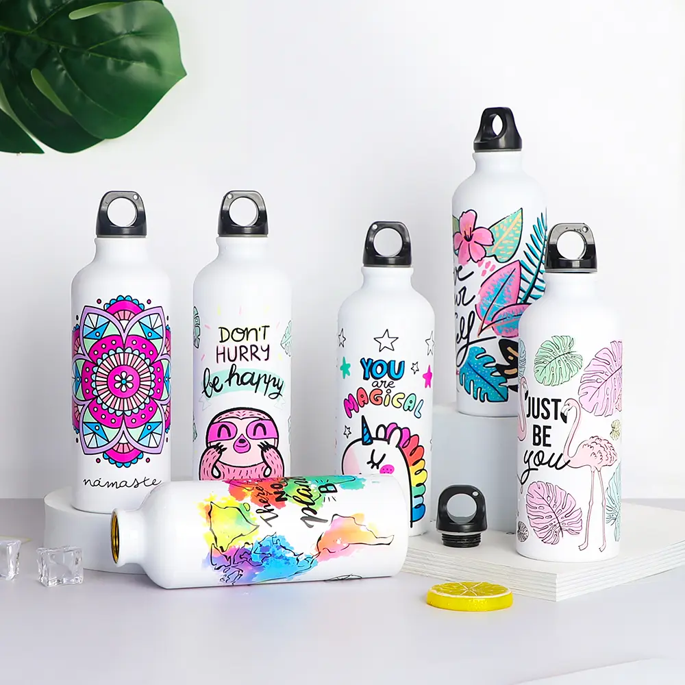
A color-changing effect is not magic. It is the result of material science, printing control, and factory discipline. When I evaluate a project, I look at the parts buyers often cannot see at first glance. Those hidden details usually decide whether the final cups feel premium or disappointing.
How Do Pigments Affect Color Changing Cups?
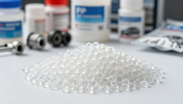
Thermochromic pigments are the heart of color changing cups1, but many buyers only see the final shade. That creates a problem because two cups can look similar in a video and still perform very differently in daily use. The solution is to check the pigment source, safety documents, and color concentration before judging price.
The pigment quality affects color density, activation speed, color stability, and compliance risk.2 Higher-grade tested pigments usually create a clearer color-changing effect3, while low-grade pigments may look weak, uneven, or unstable after production. Buyers should request material documentation and compare samples under the same temperature conditions.
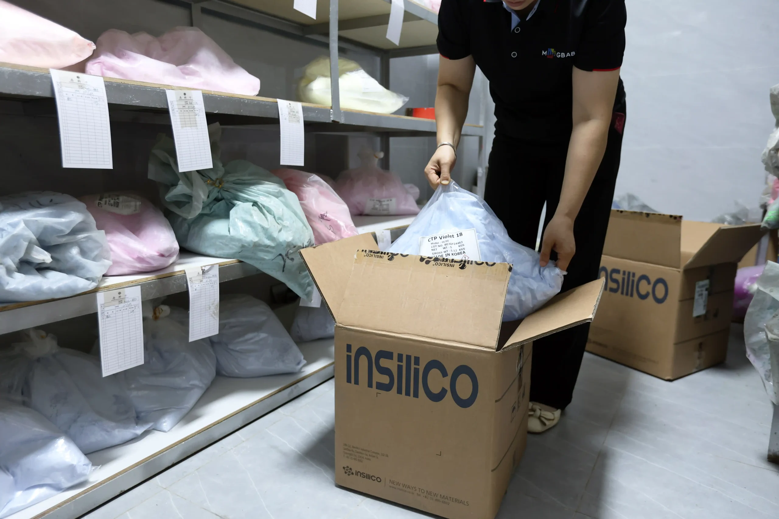
Why the pigment brand matters
In my experience, the pigment brand makes a visible difference. We use an imported Korean thermochromic pigment brand for many color changing cup projects because it usually gives stronger color concentration and a cleaner transition than many local low-cost alternatives I have seen. I still recommend that buyers verify the supplier’s actual documents, because claims should always be supported by test reports, material declarations, or supplier certificates.
For B2B procurement, pigment evaluation should include more than “does it change color?” A buyer should ask:
- What is the pigment brand or source?
- Is the pigment BPA-free according to supporting documents?
- What activation temperature is used?
- Does the color return properly after temperature recovery?
- Is the pigment suitable for the cup material and printing method?
- Can the supplier provide batch consistency records?
A good pigment usually has better color concentration, which means less pigment can create stronger visual coverage. That matters because weak pigment forces the factory to compensate with more ink, more passes, or darker base colors. Those fixes may increase cost or create quality instability.
How buyers can compare pigments
I often suggest a simple comparison test. Ask two or three suppliers for the same design, same base cup, and same activation temperature. Then test all samples together.
| Evaluation Item | What to Check | Why It Matters |
|---|---|---|
| Color density | Is the color strong before activation? | Weak density looks cheap and flat |
| Transition clarity | Does the color change cleanly? | Poor transition reduces shelf appeal |
| Return performance | Does the color come back evenly? | Uneven recovery suggests weak formulation |
| Document support | Are BPA-free or compliance documents available? | Buyers need evidence for brand review |
| Batch consistency | Can the factory repeat the result? | Bulk orders must match approved samples |
I have seen buyers focus too much on the lowest quotation. However, pigment cost is one of the areas where a very cheap price often explains the weak result. A small saving on pigment can create a large problem if the retail product looks pale, inconsistent, or fails brand inspection.
For global brands and trading companies, the safest approach is not to accept verbal claims. It is better to request documents, compare retained samples, and confirm that the pigment used in mass production matches the approved sample. This is especially important for promotional drinkware, retail gift sets, and seasonal campaigns where delivery time leaves little room for remake.
Why Does Printing Equipment Matter for Color Changing Cups?
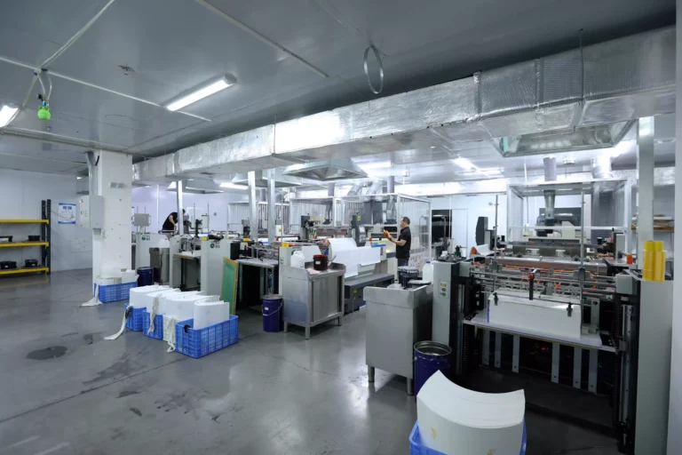
Printing equipment can limit how accurate and premium color changing cups look. Some factories only have basic rolling printing, so they must print one color at a time and may struggle with registration. That creates misalignment, blurred edges, and unstable visual results. Better equipment supports more accurate decoration and more consistent bulk output.
The printing equipment matters because color-changing designs often require accurate color placement, smooth coverage, and repeatable pressure control. Advanced transfer or screen-printing systems can improve registration and ink consistency4, while basic equipment may work only for simple logos or low-detail patterns.
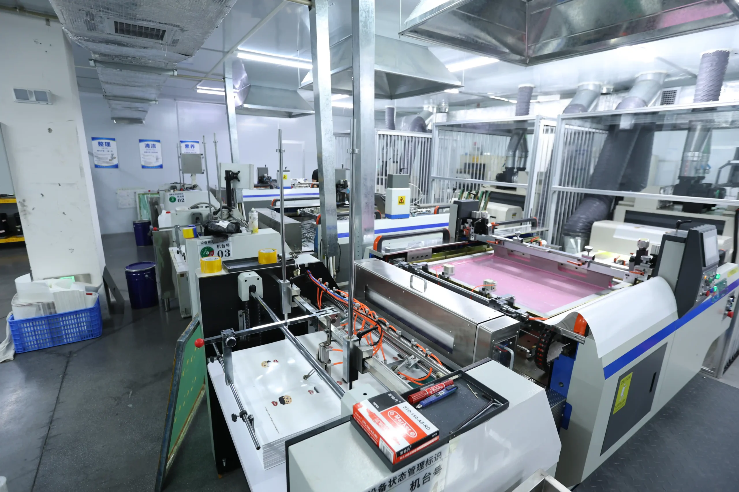
Basic rolling printing versus advanced transfer methods
When I visit or evaluate a drinkware factory, I pay close attention to the printing workshop. A factory’s decoration capability often tells me more than its product catalog. Some suppliers can show beautiful mockups, but their equipment may only support basic rolling printing. That method can work for simple one-color logos. However, it can become risky when a design needs accurate registration, gradients, large-area coverage, or multiple colors.
Color changing cups often require better control because the visual effect depends on the relationship between the base color, the printed thermochromic layer, and the final revealed design. If one layer is not aligned, the cup can look unprofessional.
Here are common printing-related problems buyers should watch for:
-
Poor registration
The printed colors do not align correctly, especially around curves. -
Uneven pressure
Some areas look darker, while other areas look thin or patchy. -
Limited design capability
The factory can only handle simple logos, not complex artwork. -
Slow multi-color production
One color must be printed at a time, which increases variation. -
Weak repeatability
The approved sample looks good, but bulk production looks different.
What equipment questions should buyers ask?
A supplier does not need to reveal every internal process detail. However, a serious buyer can ask practical questions during supplier selection.
| Buyer Question | Strong Supplier Answer | Warning Sign |
|---|---|---|
| What printing method will you use? | Clear explanation by design type | Vague answer like “normal printing” |
| Can you show similar bulk cases? | Photos or retained samples available | Only digital mockups |
| How do you control registration? | Fixtures, tooling, or process checks | “Workers will adjust it” |
| Can you print large-area color-changing designs? | Method and limitations explained | Overpromising without testing |
| How do you inspect printed cups? | Defined QC points and AQL process | No clear inspection standard |
I believe buyers should match the printing method to the design goal. A simple logo on a cold color-changing cup may not need the most advanced process. A full-wrap design with hidden graphics, however, needs stronger decoration capability.
Why factory visits or video audits help
For international buyers, an on-site visit is not always possible. Still, a video audit can reveal a lot. I usually suggest asking the supplier to show:
- Printing machines in operation
- Registration fixtures or positioning tools
- Ink mixing and color control area
- QC inspection points
- Similar color changing cups from past production
- Packaging and finished goods storage
This does not replace professional factory auditing, but it helps buyers see whether the supplier’s capability matches the quotation. A factory with only very basic equipment may still be useful for simple projects. It may not be the right partner for premium OEM/ODM bulk customization.
In my own work with drinkware projects, I have learned that the printing workshop is where many “small differences” become visible. A cup with accurate print placement feels intentional. A cup with shaky registration feels cheap, even if the material itself is acceptable.
Why Is Ink Thickness Important for Color Changing Cups?
Ink thickness is one of the most overlooked reasons why color changing cups look strong or weak. If the printed thermochromic layer is too thin, the color may not cover well and the change effect can look pale. A thicker, controlled ink layer usually creates better color density and a stronger visual transformation.5
Ink thickness affects hiding power, color strength, and final appearance. In general, screen printing can deposit the thickest ink layer, gravure printing reaches a thinner critical range, and offset printing is usually thinner. For many color-changing drinkware designs, screen printing is often the better choice when strong coverage is required.
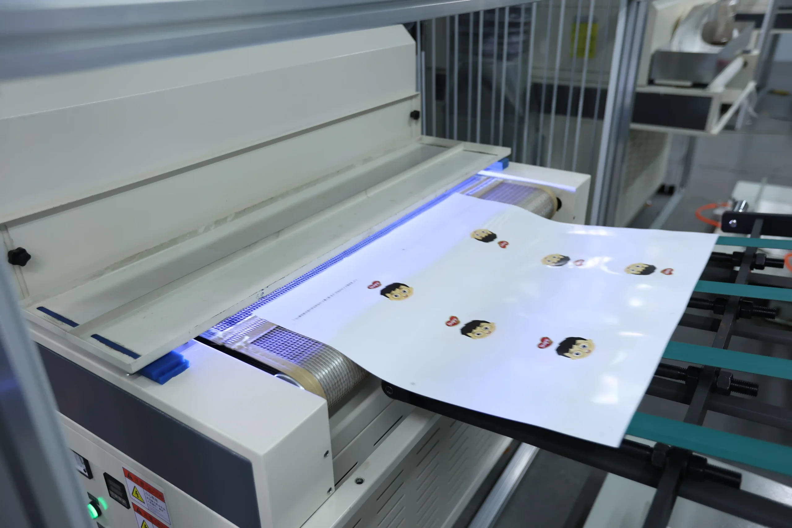
Comparing common printing thickness
From years of production practice, I have become very careful about ink deposit. Buyers may approve a design on a screen, but the final cup depends on how much functional ink actually sits on the surface. Thermochromic ink is not like ordinary decorative ink. It needs enough volume to show color strength and react clearly.
A practical thickness ranking is:
This does not mean screen printing is always the only choice. It means that when a project needs strong color coverage, screen printing often gives the factory more room to achieve the effect. Gravure printing can work for some designs, but it may sit close to the minimum acceptable thickness for certain colors. Some shades may become difficult or impossible to achieve if the ink layer is too thin.
| Printing Method | Relative Ink Deposit | Best Use Case | Risk for Color-Changing Effect |
|---|---|---|---|
| Screen printing | High | Strong colors, logos, bold designs, thicker effects | Slower for some complex designs |
| Gravure printing | Medium | Repeated patterns, certain volume projects | Some colors may look weak |
| Offset printing | Low | Fine graphics, standard printing needs | Often too thin for strong thermochromic coverage |
Why thin printing creates weak effects
A thin thermochromic layer may fail in several ways. The cup may look gray instead of rich black. A blue may look washed out. A red may lose warmth. In some cases, the hidden artwork underneath may show through too early, which reduces the surprise effect.
Buyers can use a simple sample checklist:
- Check the cup before temperature change. Is the color dense and even?
- Add cold or hot liquid based on the activation type. Does the change happen clearly?
- Observe the transition line. Is it smooth or patchy?
- Check the cup after recovery. Does the original color return evenly?
- Compare several samples. Do all cups perform the same?
Why screen printing often performs better
In our production practice, we often prefer screen printing for projects that require rich color and reliable color-changing performance. Screen printing can lay down a thicker layer of ink. That thicker layer gives the thermochromic pigment enough concentration on the surface, which improves the visual effect.
However, buyers should still confirm whether screen printing suits the artwork. Fine gradients, photographic images, and certain full-wrap designs may require process adjustment. The right answer depends on the cup shape, base material, design area, order quantity, and target cost.
Procurement tip: approve physical samples, not just artwork
A digital rendering cannot show ink thickness.7 Even a photo can mislead because lighting, camera exposure, and video editing can make the effect look stronger. I recommend that buyers approve a physical sample and keep a sealed reference sample for mass production comparison.
For brand buyers, the approval file should include:
- Cup material and size
- Pantone or target color reference
- Activation temperature
- Printing method
- Approved sample photos under standard lighting
- Retained physical sample
- Inspection standard for color density and print defects
This process may feel slower at the beginning. However, it prevents bigger problems later. In bulk OEM/ODM production, a clear sample standard is one of the best ways to protect both the buyer and the factory.
How Does Color Matching Skill Improve Color Changing Cups?
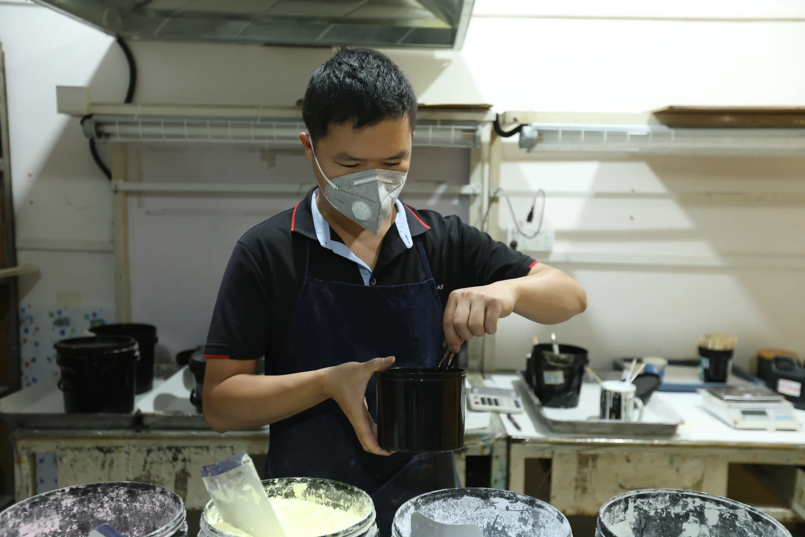
Color matching skill can decide whether color changing cups meet a buyer’s actual brand requirement. Some factories depend fully on pigment suppliers for color adjustment, which can slow communication and weaken accuracy. A factory with in-house color matching knowledge can adjust faster, test more patiently, and control results more closely.
Color matching improves color changing cups by aligning pigment formula, base cup color, ink thickness, and printing process with the buyer’s target shade. In-house color adjustment helps reduce delays, improve sample accuracy, and make bulk production more consistent with approved standards.
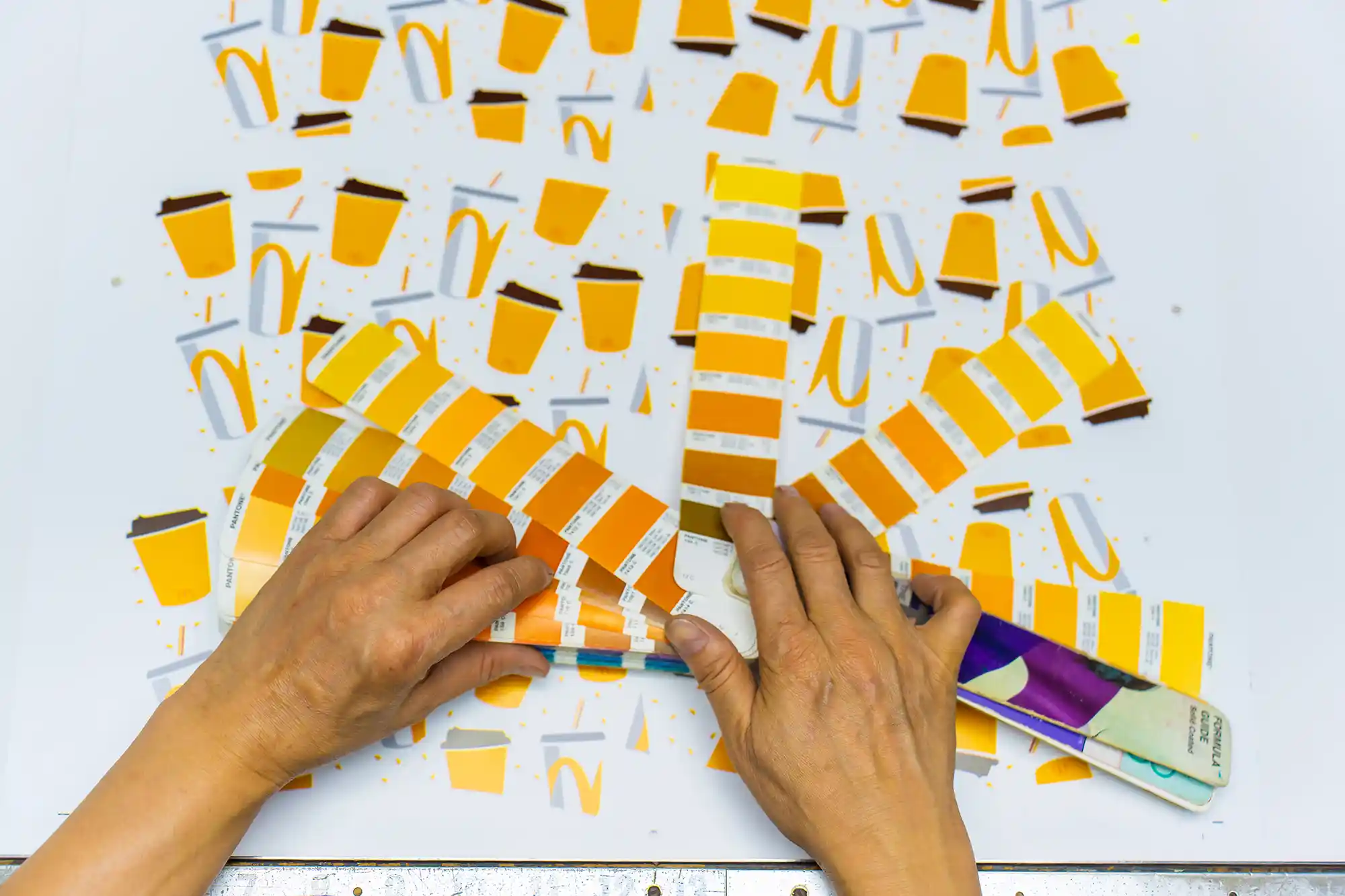
Why communication speed matters
Color matching for thermochromic drinkware is not always simple. The color before activation, the color after activation, the cup base color, and the hidden design all interact.8 If a factory must send every adjustment back to the pigment supplier, the process becomes longer. Each round may involve explaining the issue, waiting for a revised formula, making a new sample, and checking again.
This slow loop can create frustration for buyers. It can also lead to compromise. Some factories may stop after “close enough” because they do not have the technical patience or internal skill to keep adjusting.
I have seen this happen in sampling conversations. A buyer asks for a specific purple. The sample comes back too red. The next sample becomes too blue. Then the activation effect becomes weak because the adjustment changed pigment balance. A capable team needs to understand both color and process, not just follow a formula.
What good color matching includes
A strong color matching process should consider:
- Target shade before temperature change
- Target appearance after temperature change
- Cup body material and base color
- Pigment concentration
- Ink viscosity
- Printing thickness
- Drying or curing conditions
- Lighting conditions during approval9
- Batch-to-batch tolerance
For international buyers, I suggest using Pantone references where possible, while understanding that thermochromic pigments may not match every Pantone perfectly. Functional pigments have limits. A professional supplier should explain those limits early instead of promising every color without testing.
Sample approval standards
A good supplier should help buyers define realistic acceptance criteria. For example:
| Standard Area | Practical Control Method |
|---|---|
| Visual color | Compare with approved sample under standard lighting |
| Activation effect | Test at agreed temperature range |
| Color return | Check after cup returns to normal temperature |
| Print position | Measure against artwork tolerance |
| Surface defects | Inspect for scratches, pinholes, bubbles, and uneven coverage |
| Batch consistency | Compare random samples from production lots |
This approach is especially important for buyers who serve European, American, Japanese, or Korean customers. These markets often have strict expectations for appearance, consistency, packaging, and documentation. A product that passes as a simple giveaway in one market may not satisfy a premium retail or brand campaign in another.
Why experience matters in OEM/ODM projects
Our business has 36 years of experience in color-changing drinkware manufacturing, including plastic, glass, ceramic, aluminum, and stainless steel drinkware. I mention that as business context, not as a replacement for buyer verification. Buyers should still evaluate samples, documents, and production capability.
Experience matters because many issues are not visible in the quotation stage. A team with long-term production practice can often predict risks earlier:
- A certain color may look weak with gravure printing.
- A cup curve may make registration more difficult.
- A base material may need surface treatment.10
- A design may require screen printing instead of offset.
- A tight delivery schedule may not allow multiple color revisions.
When a factory has internal color matching skill, it can communicate more clearly with buyers. It can say, “This color is achievable,” “This color needs a thicker layer,” or “This target will be difficult with the current design.” That honesty saves time and protects the project.
For procurement teams, the key point is simple. Do not evaluate only the product. Evaluate the supplier’s technical conversation. A factory that asks detailed questions about color, temperature, artwork, usage, and compliance is often more reliable than a factory that says yes to everything immediately.
Frequently Asked Questions
What makes color changing cups change color?
Color changing cups usually use thermochromic pigments or inks that react to temperature changes. When the cup surface reaches a certain hot or cold activation range, the pigment structure changes and the visible color shifts.11 The exact effect depends on pigment quality, ink thickness, printing method, and cup material.
Are color changing cups BPA-free?
Some color changing cups can be BPA-free12, but buyers should verify this through supplier documents and relevant test reports. The claim depends on the cup material, pigment system, coating, and production process. I recommend requesting updated compliance documentation before confirming bulk orders.
Which printing method is best for color changing cups?
Screen printing is often a strong choice when the project requires thick ink deposit and rich thermochromic color. Gravure and offset printing may suit some designs, but they usually deposit thinner ink layers. The best method depends on artwork complexity, cup shape, order quantity, and target effect.
Why does my sample look better than bulk production?
This usually happens when pigment batches, ink thickness, printing pressure, drying conditions, or QC standards are not controlled well. Buyers should keep an approved physical sample, define inspection criteria, and confirm that the same pigment and printing method will be used in mass production.
How should buyers evaluate a color changing cup supplier?
Buyers should evaluate pigment documentation, printing equipment, color matching ability, sample consistency, factory experience, and quality control process. They should also review similar production cases and request physical samples. For high-risk projects, professional inspection or factory auditing can help reduce procurement risk.
Conclusion
Color changing cups perform better when the supplier controls the full production chain, not just the final decoration. Strong performance usually comes from tested pigments, accurate printing equipment, sufficient ink thickness, and skilled in-house color matching. I always encourage buyers to compare physical samples, verify documents, and ask technical questions before choosing a factory. If you need OEM/ODM bulk customization for plastic, glass, ceramic, aluminum, or stainless steel color-changing drinkware, I would be glad to help you evaluate the right production solution.
"Thermochromism", https://en.wikipedia.org/wiki/Thermochromism. A general reference on thermochromism defines thermochromic materials as substances whose optical appearance changes with temperature, supporting the statement that thermochromic pigments provide the functional color-change effect in such cups. Evidence role: definition; source type: encyclopedia. Supports: Thermochromic pigments are materials that change color in response to temperature and can be used in coatings, inks, or consumer products.. Scope note: This supports the general material principle, not the performance of any particular cup or supplier. ↩
"Color stability of thermochromic pigment in maxillofacial silicone", https://pmc.ncbi.nlm.nih.gov/articles/PMC3675297/. Research on thermochromic pigments and microencapsulated colorants reports that formulation, capsule structure, and dye chemistry influence color response, optical intensity, and stability, which contextualizes the need to evaluate pigment quality and documentation. Evidence role: general_support; source type: paper. Supports: Thermochromic pigment formulation and microcapsule properties affect optical density, temperature response, and durability, while chemical composition is relevant to compliance assessment.. Scope note: The source would provide general materials evidence rather than proving the quality of any named pigment brand. ↩
"Assessment of Thermochromic Packaging Prints' Resistance to UV ...", https://pmc.ncbi.nlm.nih.gov/articles/PMC10007136/. Materials studies of thermochromic inks show that pigment formulation, concentration, and stability testing affect color intensity and reversibility, providing contextual support for the claim that tested pigments can yield clearer color-change effects. Evidence role: general_support; source type: paper. Supports: Controlled thermochromic pigment formulation and testing are associated with measurable differences in color intensity, reversibility, and stability.. Scope note: This is contextual support and does not establish a universal ranking of commercial pigment grades. ↩
"strands and s trands and standards - screen printing technology", https://schools.utah.gov/cte/_cte/strands/ScreenPrintingTechnology.pdf. Technical printing references describe registration accuracy and ink-film uniformity as process-control outcomes influenced by equipment setup, substrate handling, and print parameters, supporting the claim that more capable systems can improve consistency. Evidence role: mechanism; source type: education. Supports: Printing process control, equipment precision, fixtures, and ink-deposit control affect registration accuracy and consistency.. Scope note: The source would support printing principles generally, not prove the performance of a specific factory’s machines. ↩
"Implications of Thermochromic Ink", https://digitalcommons.calpoly.edu/cgi/viewcontent.cgi?article=1055&context=grcsp. Color and printing studies indicate that pigment concentration and ink-film thickness affect optical density and hiding power, providing a mechanistic basis for the claim that a controlled thicker thermochromic layer can strengthen the visible effect. Evidence role: mechanism; source type: paper. Supports: Ink-film thickness and pigment loading influence optical density, coverage, and perceived color strength.. Scope note: The relationship is not unlimited; excessive thickness may affect drying, adhesion, surface finish, or durability. ↩
"Ink Film Thickness and its Relation to Dot Size in Photo Offset Lithography", https://repository.rit.edu/cgi/viewcontent.cgi?article=7666&context=theses. Printing-technology literature reports that screen printing can produce comparatively thick ink films, whereas offset lithography typically uses thinner ink films and gravure deposits vary with cell geometry, supporting the article’s practical ranking of ink-deposit capacity. Evidence role: general_support; source type: research. Supports: Typical ink-film thickness differs by printing method, with screen printing commonly capable of higher deposits than offset and many gravure applications.. Scope note: Exact thickness depends on mesh, ink, plate or cylinder geometry, substrate, and operating parameters. ↩
"Producing High-quality Printed Marketing Materials", https://www.communications.pitt.edu/services/design/print-and-suppliers/producing-high-quality-printed-marketing-materials. Print-production and color-management references distinguish digital proofs from physical print samples because screen display cannot reproduce ink-film thickness, substrate interaction, or coating behavior, supporting the need for physical sample approval. Evidence role: general_support; source type: education. Supports: Digital previews are limited representations of printed output and do not measure or reproduce physical ink deposit, substrate interaction, or functional coating behavior.. Scope note: This supports the general limitation of digital renderings, not a specific failure mode in thermochromic cups. ↩
"Facile full-color printing with a single transparent ink - PMC - NIH", https://pmc.ncbi.nlm.nih.gov/articles/PMC8457659/. Printing and coating research shows that final color appearance depends on ink optical properties, layer thickness, substrate color, and overprint interactions, supporting the claim that thermochromic cup appearance is a layered system rather than a single pigment value. Evidence role: mechanism; source type: paper. Supports: Printed color appearance is affected by ink properties, layer structure, substrate color, and viewing or activation conditions.. Scope note: The source would support the general interaction of layers and substrates, while the exact appearance must still be verified by product-specific samples. ↩
"Standard illuminant", https://en.wikipedia.org/wiki/Standard_illuminant. Color-assessment standards specify controlled viewing conditions and standard illuminants for judging printed color, supporting the article’s inclusion of lighting conditions in sample approval. Evidence role: expert_consensus; source type: institution. Supports: Standardized viewing conditions and illuminants are used for reliable visual color assessment because perceived color changes with lighting.. Scope note: Such standards guide visual evaluation generally and do not define acceptance tolerances for a specific thermochromic drinkware project. ↩
"Plasma Treatment of Large-Area Polymer Substrates for the ...", https://pubmed.ncbi.nlm.nih.gov/38470757/. Polymer surface-treatment studies report that pretreatments can raise surface energy and improve adhesion of inks or coatings on plastic substrates, supporting the claim that some base materials may require treatment before printing. Evidence role: mechanism; source type: paper. Supports: Surface treatments such as corona, plasma, or flame treatment can increase surface energy and improve ink or coating adhesion on low-energy substrates.. Scope note: The need for treatment depends on the specific substrate, ink chemistry, and production process. ↩
"Relation between colour- and phase changes of a leuco dye-based ...", https://pmc.ncbi.nlm.nih.gov/articles/PMC5882991/. Studies of thermochromic leuco-dye systems explain that temperature-dependent changes in molecular interactions or phase state produce reversible changes in visible color near a designed transition range. Evidence role: mechanism; source type: paper. Supports: Thermochromic systems, including leuco-dye systems, change optical state when temperature alters molecular interactions or phase behavior around a designed transition temperature.. Scope note: The mechanism may vary by pigment chemistry, so the citation should be read as support for common thermochromic systems rather than every commercial formulation. ↩
"Bisphenol A (BPA): Use in Food Contact Application", https://www.fda.gov/food/food-packaging-other-substances-come-contact-food-information-consumers/bisphenol-bpa-use-food-contact-application. Government food-contact guidance on bisphenol A identifies BPA as a chemical associated with particular plastics and resins, supporting the article’s caution that BPA-free status depends on the specific material system and documentation. Evidence role: general_support; source type: government. Supports: BPA exposure concerns are linked to specific material chemistries used in food-contact articles, so BPA-free claims require material-specific verification.. Scope note: This supports the need for verification of BPA-related claims, not the BPA-free status of any individual cup. ↩